Showing the most popular jobs in each state is interesting (as I showed in my previous two blogs 1, 2) ... but not that interesting. How about something a little more quirky?!? ... Let's determine the most disproportionately popular job in each state!
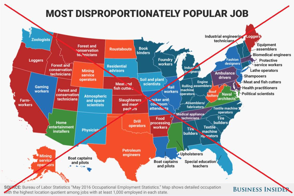
Their Map
I got the idea for this map from a neat Business Insider article. Their map shows which job in each state has far more of a certain job per capita than the nation as a whole, based on the location quotient. The location quotient is the ratio of the local concentration of a certain job, to the national concentration of that job. Below is a copy of their map. Note that it shows the Textile Machine Operators in North Carolina (my state), Roof Bolters in Virginia (hmm - not sure what kind of roof & bolting that is), and Roustabouts in North Dakota.
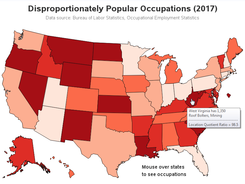
My Map
As interesting as their map was, I had a few ideas for changes I'd like to make. Therefore I downloaded the Occupational Employment Statistics data from the Bureau of Labor Statistics (BLS) website, imported the spreadsheet into SAS, and started working on my own version of the map. Here are some of my changes:
- I'm not a big fan of long/crowded text labels on a map, therefore I used HTML mouse-over labels instead. This allows me to show the full text of the job titles (whereas I suspect the original map shortened some of the job titles, which could compromise the data integrity). I also included the state name and the Location Quotient Ratio in my mouse-over.
- The Business Insider map colored the states by broad job categories (I think?). I didn't see anything in the BLS data indicating what category each job was in, and I thought their map's coloring seemed a little arbitrary, so I didn't assign colors that way in my map. Instead, I used gradient shading to show how disproportionate the jobs were - darker states have a higher Location Quotient Ratio.
- And I used the latest data (2017, rather than 2016).
Below is a snapshot of my map - click here to see the interactive version with the HTML mouse-over text. Notice that my mouse-over label for West Virginia is "Roof Bolters, Mining" rather than just "Roof Bolters" as the previous map showed. Many of the other job titles are also longer, and therefore more descriptive - I suspect they summarized/shortened the job titles in the Business Insider map, to help fit the labels on the map. I invite you to explore my interactive map, and share/discuss anything 'interesting' you might find, in the comments!
How'd He Calculate the Location Quotient Ratio?
For those of you who do a bit of coding, I thought you might be interested in the code I used to calculate the location quotient. I used a combination of data steps and SQL. First, I use SQL to summarize the employment in several different ways (state, and national). And then I use a data step to calculate the state & national concentrations, and divide them to produce the location quotient ratio. Here's a link to my full SAS code, if you'd like to experiment with it.
proc sql;
create table my_data as
select unique *, sum(employment) as employment_total_state
from my_data
group by statecode;
create table my_data as
select unique *, sum(employment) as employment_per_title_us
from my_data
group by occ_title;
create table my_data as
select unique *, sum(employment) as employment_total_us
from my_data;
quit; run;
data my_data; set my_data;
employment_pct_state=employment/employment_total_state;
employment_pct_us=employment_per_title_us/employment_total_us;
location_quotient_ratio=employment_pct_state/employment_pct_us;
run;
Something Fun
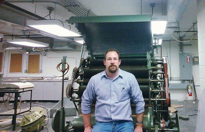
And now, if you made it through all that, you deserve a little fun! Below is a picture of my old college buddy Brian, posing beside of a machine that might be used in one of those disproportionately popular jobs - what is this machine/job? (leave your guess in the comments section) Need a hint? He and I attended grad school together at the NC State University College of Textiles, and he now teaches at Thomas Jefferson University. Brian really likes working with machines, and he can figure out how to use and repair just about anything mechanical!


2 Comments
Brian seems to be repairing a "card" used to untangle, clean and turn fibers into sliver or web. It looks like a card with workers and strippers as would be used on a wool or long staple card?
You are correct, Dr. Little! :)